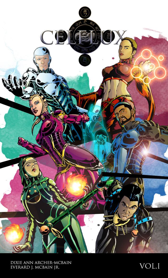
When I design, I usually go through many different variations before I settle on a particular design. Working on Celflux was no different. I decided to move completely away from the dark, shadowy, semi realistic designs that I was working with previously, and made an about turn and am now going with comic book style, heavily inked and sharp shape tones. This one has more of an impact on me. I’m putting it up here for you guys to see it and let me know what you think of this style as opposed to the previous style. You can have a look at the old design here.
UPDATE:
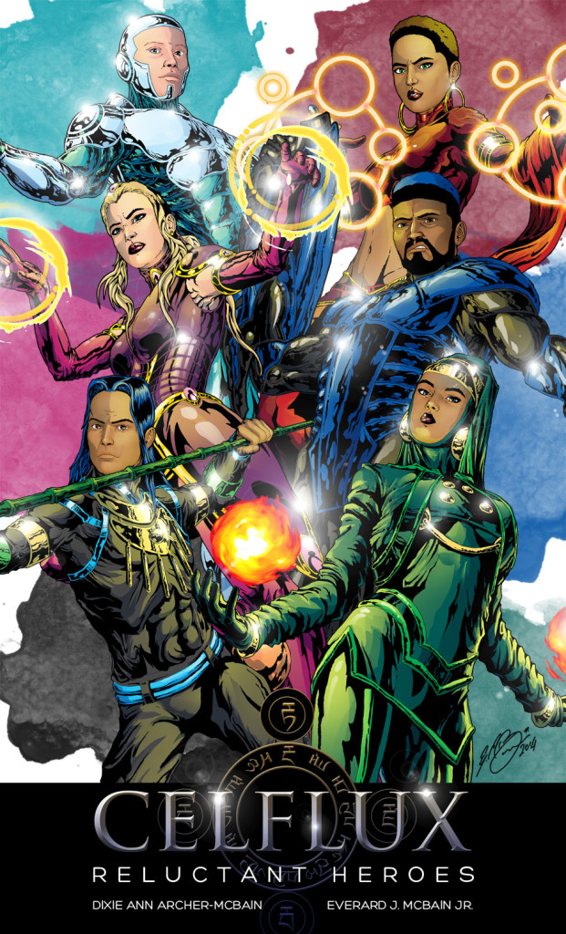
I’ve updated the artwork for the cover of the first volume. I’ve left the first one up so you can compare. Here is the new artwork.
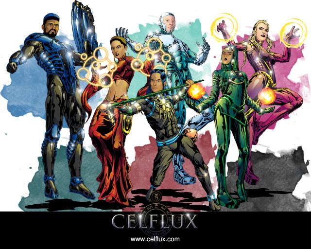
And here’s the group together in a promo shot.


